California Freight Cleanup → Investigation 8-1
Where should the next PM2.5 monitor go?
21,164 cells • 520 AQS monitors • decision-optimal top-1 at 8.2 km • kriging-optimal at 241.7 km, pop. 0The classic monitoring network design question is "where is PM2.5 measurement coverage worst?" The decision-relevant question is different: "where does an additional sensor reduce health-decision uncertainty the most?" These two questions lead to sensor sites 233 km apart. This investigation maps both, quantifies the difference in expected value, and identifies the top-10 decision-theoretic candidates across California.
The decision
A regulator choosing where to deploy one additional PM2.5 monitor under a constrained budget. The naive answer is to fill the biggest spatial gap in the existing network. The decision-relevant answer is to place the sensor where it reduces health-decision uncertainty the most. This investigation maps both approaches across all 21,164 ISRM grid cells in California and quantifies how much the two criteria disagree.
Methodology
Monitoring Value Index (MVI). For each of 21,164 ISRM grid cells, MVI is the cell’s contribution to total health-impact variance under the log-linear BenMAP concentration-response function. Variance contribution is proportional to (mortality burden × β)² × Var(PM2.5). Two CRF endpoints are blended 50/50: Di et al. 2017 (β = 0.00705, ≥65 population) and Krewski et al. 2009 (β = 0.00545, ≥30 population). PM2.5 variance uses a 10% coefficient of variation applied to the ISRM total field, preserving intra-basin heterogeneity. MVI is normalized to [0, 1].
Gap score. gap_score = MVI × log(1 + dist_km),
where dist is the haversine distance to the nearest of 520 active California AQS
PM2.5 monitors. The log term dampens extreme distances (remote wilderness)
while still rewarding cells meaningfully far from coverage. Both MVI and gap score
are normalized to [0, 1].
Candidate ranking. Cells are ranked by gap score within each of five air basin regions (Bay Area, LA Basin, SJV, Sacramento, rest-CA), and the top 10 per region are exported. An overall top-10 is also produced. The list was widened from 5 to 10 per region to give Investigation 8-2 sufficient candidate depth to guarantee a DAC site per region in equity-constrained placement variants.
Per-sensor EVSI. For each top-10 candidate, we estimate expected reduction in health-decision uncertainty: all cells within a 20 km radius have their PM2.5 CV reduced from 10% to 3% (typical AQS precision post-QC). The variance reduction translates to a deaths-standard-deviation reduction. EVSI = deaths_std_reduction × $11.6M (VSL) × 0.01, where 0.01 is a heuristic 1% decision-pivot probability (not POMDP-derived; the proper EVSI integral lives in Investigation 8-2’s POMDP). A defensible pivot probability requires a full POMDP—see Investigation 8-2. Monitor cost: $25,000/yr.
Findings
Decision-theoretic vs. kriging-optimal placement: 233 km apart
The kriging-optimal cell (max distance from nearest existing monitor: 241.7 km, region rest-CA, population 0) and the decision-theoretic top cell (max gap score: 8.2 km from nearest monitor, LA Basin, population 4,369) are 233 km apart with zero population overlap. An agency using coverage criteria alone deploys sensors into unpopulated wilderness.
| Criterion | Region | Dist to monitor (km) | Population |
|---|---|---|---|
| Kriging-optimal (max distance) | rest_ca | 241.7 | 0 |
| Decision-optimal (max gap score) | la_basin | 8.2 | 4,369 |
EVSI three-tier split: top-3 LA Basin worth deploying, ranks 4–10 net-loss
EVSI is highly skewed. The top-3 candidates (all LA Basin) earn $27k–$41k/yr at 1.1–1.7× ROI against a $25k annual cost. Ranks 4–10 earn $8k–$192/yr—all below break-even. The 20 km influence radius times LA Basin population density dominates the signal. Rural rest-CA cells rank high on gap score but cover only 5,000–6,000 people, making EVSI negligible.
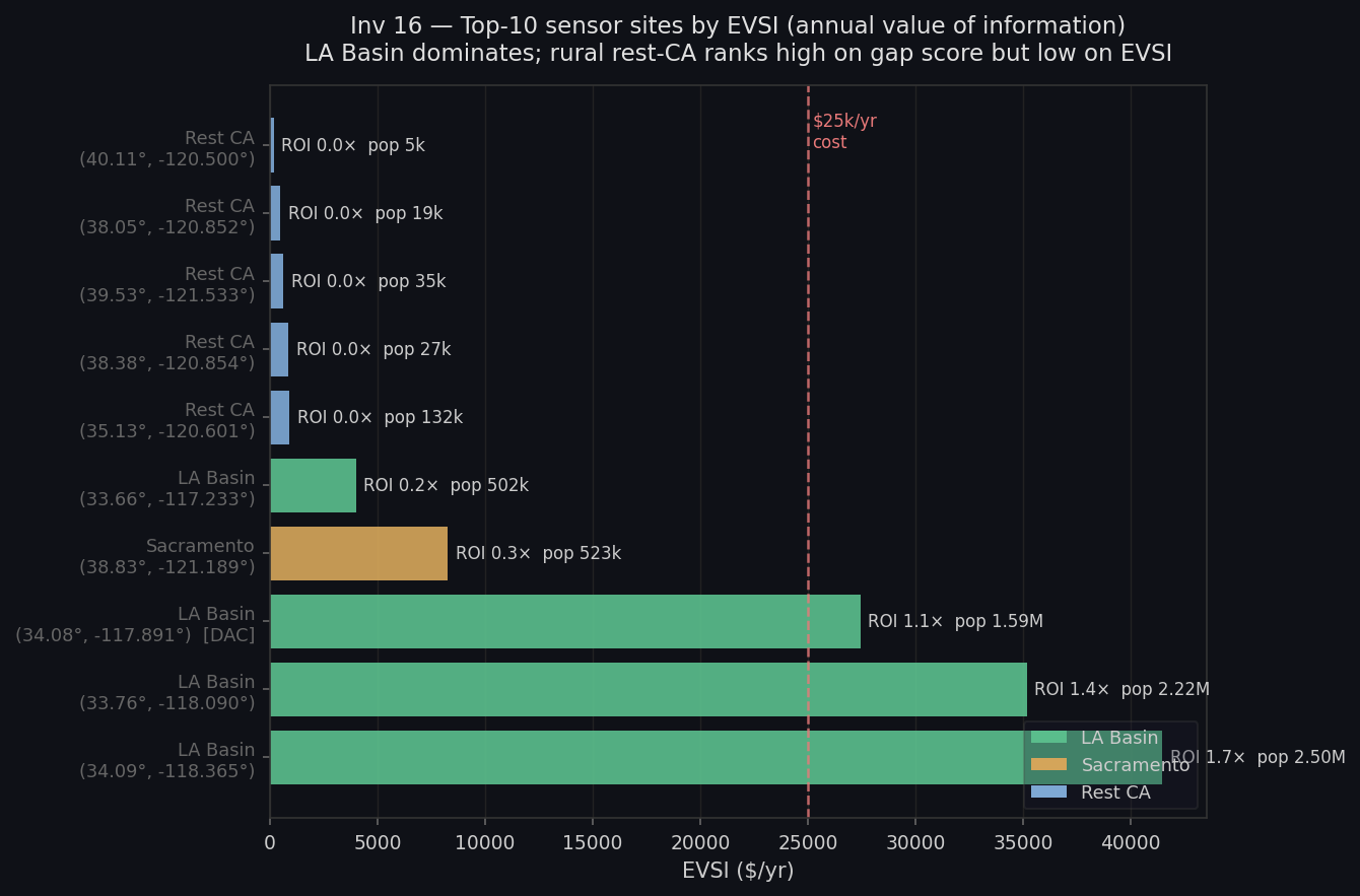
| Rank | Region | Lat | Lon | Pop covered | EVSI ($/yr) | ROI | DAC |
|---|---|---|---|---|---|---|---|
| 1 | la_basin | 33.7643 | −118.0901 | 2,215,187 | $35,178 | 1.4× | No |
| 2 | rest_ca | 38.051 | −120.8518 | 19,434 | $483 | 0.0× | No |
| 3 | la_basin | 34.0905 | −118.3651 | 2,498,862 | $41,458 | 1.7× | No |
| 4 | la_basin | 33.6614 | −117.2328 | 501,690 | $3,991 | 0.2× | No |
Ranks 5–7 are three rural rest_ca cells (lat 38.4–40.1, lon −120.5–−121.5) with sub-$1k/yr EVSI — below the cost floor. Full coordinates in investigations/16_monitor-voi-map/latest/results.json → overall_top10. | |||||||
| 8 | la_basin | 34.0789 | −117.891 | 1,588,070 | $27,428 | 1.1× | Yes |
| 9 | sacramento | 38.8257 | −121.1887 | 522,896 | $8,263 | 0.3× | No |
DAC equity: gap-score optimization does not naturally target disadvantaged communities
Only 1 of the overall top-10 candidate sites is in a disadvantaged community (rank 8, LA Basin, 1.6M people in 20 km radius, EVSI $27k/yr). Mean DAC distance to the nearest existing monitor (9.4 km) is actually shorter than non-DAC distance (10.6 km)—DAC cells are not under-monitored by spatial coverage metrics. They are under-monitored relative to their health-decision weight. This is not a coverage problem; it is a prioritization problem. Equity must be added as an explicit objective in Investigation 8-2—it does not come for free from gap-score optimization.
Caveats
- 1% decision-pivot probability is the most consequential assumption. EVSI scales linearly: at 5% pivot probability all ROI figures scale 5×; at 10%, they scale 10×. The 1% figure is deliberately conservative and should be read as a lower bound. A defensible pivot probability requires a POMDP (Investigation 8-2).
- 20 km influence radius is a kriging-literature heuristic, not a fitted variogram range. In dense urban grids (LA Basin cell spacing ~0.5 km), 20 km covers 800–1,100 cells and may overstate one sensor’s marginal information value where AQS coverage is already dense. The SJV candidate (6.4 km from nearest monitor) is most defensible; central LA candidates are least.
- PM2.5 CV = 10% is a portfolio-wide placeholder. The relative MVI ordering is stable; the absolute EVSI scale is not validated until a fitted GP surrogate replaces it.
- Mortality rates are 2013 vintage (mortalityRates2013.shp). Post-2013 changes (COVID mortality surge, long-term PM2.5 trend improvement) are not reflected.
- The kriging-vs-decision comparison is illustrative, not algorithmic. A real kriging-based design would optimize over a population-weighted variance functional, not raw distance. Read the disagreement diagnostic as illustrative, not as a knock against kriging.
Provenance
| Item | |
|---|---|
| run.py | [internal artifact] |
| results.json | investigations/16_monitor-voi-map/latest/results.json (sha256 fb3c0bc9bc58) |
| analysis.md | investigations/16_monitor-voi-map/latest/analysis.md |
| scenario.md | investigations/16_monitor-voi-map/latest/scenario.md |
| AQS sites | data/raw/aqs_sites/aqs_sites.csv — 520 active CA PM2.5 monitors |
| ISRM PM2.5 | data/processed/isrm_sector_pm25.npz — sector-summed total field |
| Grid covariates | data/processed/grid_covariates_real.parquet |
| Demographics | data/processed/tract_demographics.parquet, grid_tract_crosswalk.parquet |
| Mortality rates | data/raw/evaldata_v1.6.1/mortalityRates2013.shp (2013 vintage) |
| VSL | EPA 2024 canonical: $11.6M |
| CRFs | Di et al. 2017 NEJM (β = 0.00705, ≥65); Krewski et al. 2009 (β = 0.00545, ≥30) |
| Last run | 2026-05-01 (results sha256 fb3c0bc9bc58) |